
An intro animation incorporates the user's own photos. I created this prototype in Flash so the developer had a clear idea how to animate it.
Bundle is a photo sharing iPhone app I co-created at CX. As is a robust consumer cloud platform CX lets people backup and manage their files from anywhere. We already had a general purpose app, but wanted to create a better experience for storing and sharing photos. In a team of two, I was responsible for seeing the product from inception to release and beyond.
My role included:
Product development | Usability testing | Wireframing | Design | UX | Branding
Unfortunately bundle is no longer available in the App Store :(
Establishing key goals

We created interaction flows in a giant Illustrator document based on requirements and design goals
We designed the app from the ground up and took the opportunity to think outside the box for creating an ideal photo app. We wanted to focus on real end-user value and create a superior experience. After reviewing past user interviews and much discussion, we established two key design goals:
- Reduce as much friction as possible to use the app
- Focus on sharing photos quickly
To Start, we created a list of app requirements and user goals that we wanted to achieve. We then wireframed out a basic flow for all the possible interactions. As we iterated on the flows we were able to remove pages and simplify the journey.
People don’t care where their photos are located
We took a very hard-lined, realistic approach to the app design. Every idea was scrutinized about whether it fit our design goals and added real value. After some interviews we found that people mainly just want to accomplish a task, and value is perceived in the context of what they're trying to achieve. What that meant for us, is that people want to view and share their photos (i.e., the task). They don’t care if their photos are located on their device or in the cloud.
The solution was to show people all of their photos - both on their device and in the cloud. Since we weren't limiting using photos from the app itself, this approach gave users a much more organic experience. It also reduces cognitive load and people don't have to think about where their photos are located before sharing them.
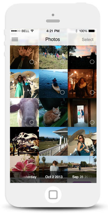
All your photos - both on your device and in the cloud - are shown. A hollow icon indicates photos that aren't in the cloud.
Quickly upload a photo to the cloud by tapping on the icon. A loading animation indicates the uploading process.
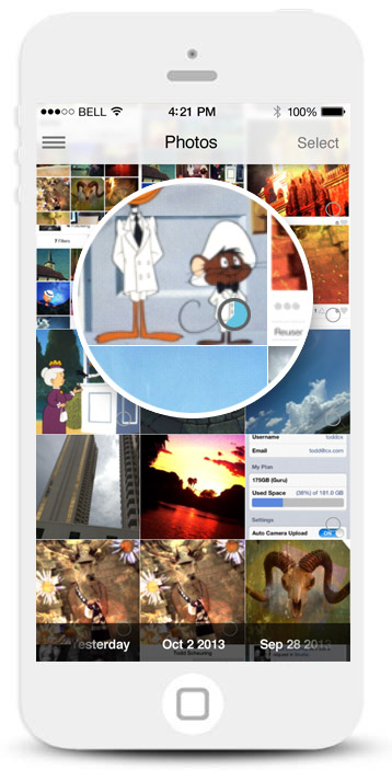
Making it easier to scan and share photos
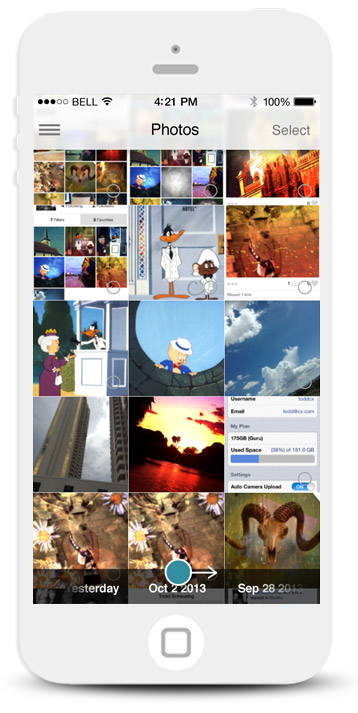
A timeline lets you quickly scrub through your photos.
Dragging your finger lets you "paint on" a selection of photos.
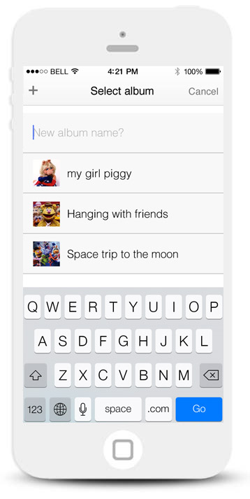
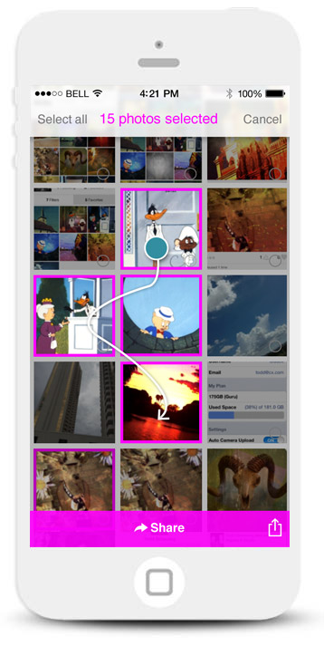
People can share, or add their select photos to an album.
As we thought about ways to improve sharing photos, we came up with several interactions that would help people scan and share photos faster:
- We created an ability to “paint” a selection: When people begin selecting a photo, they can continuously drag their fingers to select other photos. This makes it easy to select a sequence of photos.
- We added a quick date scrubber: As a quick way to jump to a date and scan through photos faster, people can swipe the timeline horizontally to scroll through their list of photos.
Designing a seamless signup flow
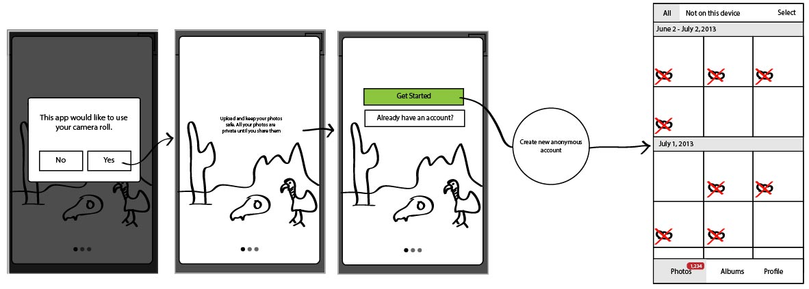
People can start using the app right away if they don't have an account.
One of our biggest barriers to entry was that CX required people to have an account before uploading and sharing their photos. Historically, our mainline mobile app experienced a significant bounce rate on the signup page, so we wanted to try and reduce as much friction as possible during this process.
The solution was removing the signup process altogether. People could begin using the app right away without filling out a sigup form. We would create an invisible account for them based on their device ID. We would also remember the device ID, so that if they logged out, the app would remember their device when they returned.
People can start using the app right away without signing up for an account.
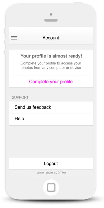
We directed people to go to the rails app if they wanted to complete their account.
If a person wanted to access their photos from another CX app, we would direct them to a rails page to complete the rest of the signup process.