
Moxie lets you discover and reuse anyone's custom photo filters on your own photos.
Moxie is an iPhone app I co-created with Kyle Stewart and Suzy Crawford.
It started as an idea from my friend Kyle who wanted a way to be more creative with his photos. The idea was to build a community where people could create custom photo filters from scratch and let other people reuse them on their own photos.
As the designer and product owner for the app, I was involved in every step of the way, including:
Design & UX | Product development | User research | Website design & Font-end development | Promotion video | Branding
Creating a powerful photo editing tool
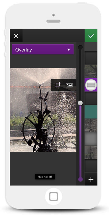
Initial design - We used a layer stacking mental model for the edit screen. Our first draft displayed the layers vertically.
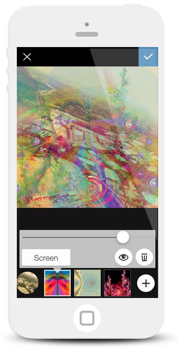
Final design - After user testing, we found that people preferred displaying layers horizontally instead.
Seeing how your new layer will affect the canvas helps simplify the blending process.
The challenge: Our goal was to create a photo editing tool powerful enough for advanced users to enjoy and simple enough that novice users could pick up and quickly start using. We wanted the process to be casual and quick, so that people could create a piece of art in one sitting.
The process: We started by talking to people about what photo apps they currently use, what they like and dislike about the apps, and what they wanted to do with their photos in general. We gathered a list of the most common responses and started brainstorming ideas about requirements for the photo editing process. After that we created flows and wireframes for a UI based on the requirements. Our idea was to create an interface that would use a "layer stacking" mental model. The idea was that you can pile up a bunch of layers on top of each other to create a final image.
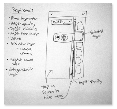
We brainstormed ideas and requirements for the editing tool.
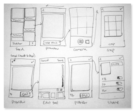
I created user flows to get an idea how the user could progress through the photo editing process.
We needed to test our assumptions that people would understand the idea of stacking layers on top of each other, so we put together a quick paper prototype of the photo editing process. We showed the prototype to a couple people and although they did in fact understand the concept of layering images on top of each other, there was some confusion about how to select a layer and dismiss the sidebar.
With our assumptions about the "layer stacking" mental model validated we decided to move forward with the stacking design and continue testing the rest of the UI. Since a paper prototype lacks a lot of subtle affordances and interactive queues, our next step was to create an actual interface that people could freely interact with. After we had a working native iOS prototype, we gathered some more people and conducted some more user tests to see if the overall editing flow made sense.
I created a quick paper prototype to see if people understood the idea of "Stacking" layers on top of each other.
We used a script with tasks to conduct a couple usability tests in exchange for a couple beers.
We found that:
- Displaying layers horizontally, instead of stacking them vertically, made more sense to people.
- People had trouble editing and managing layers (selecting, hiding and moving them around).
- People were confused by the idea of blending layers together.
The solution: Instead of a small vertical column, we updated the layers to display horizontally at the bottom of the screen. Not only did this make the UI more ergonomically friendly (because it gave people more access to edit the layers with their thumb), but also gave us more screen real estate to enlarge the thumbnails themselves.
Since people were having troubles managing layers, we made the selection state more apparent and provided more explicit affordances by labeling buttons and creating more contrast for interactive elements.
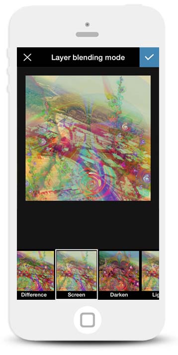
To simplify the blending mode process, we de-emphasized the idea of manually choosing a blending mode and focused on what the image will look like when you select the different settings. We also added it to the end of the “add new layer” process, so it would feel more like finalizing the process.
Leveraging behavior from existing apps
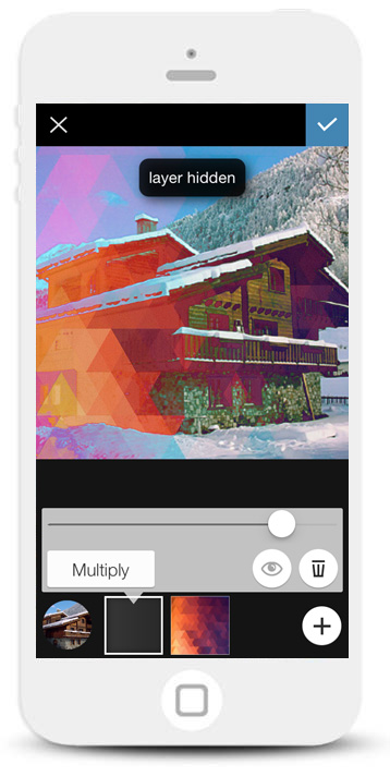
Being able to toggle layers on and off lets you see how they affect the canvas.
I wanted to take a look at current behaviors for using similar layer editing apps like Photoshop, so I sat down and examined a couple designer friends of mine as they worked in Photoshop. One of the things I found was that people often turn layers on and off during the design process to see how it affects the main canvas. It’s also a way to quickly see what layer you’re on. This seemed to be a common behavior, so I wanted to make sure we gave people the ability to quickly toggle a layer's visibility in the app.
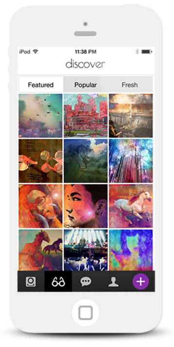
Focusing on a social network
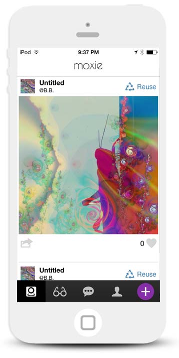
Discover and follow other Moxie artists. See their art in a personalized feed.
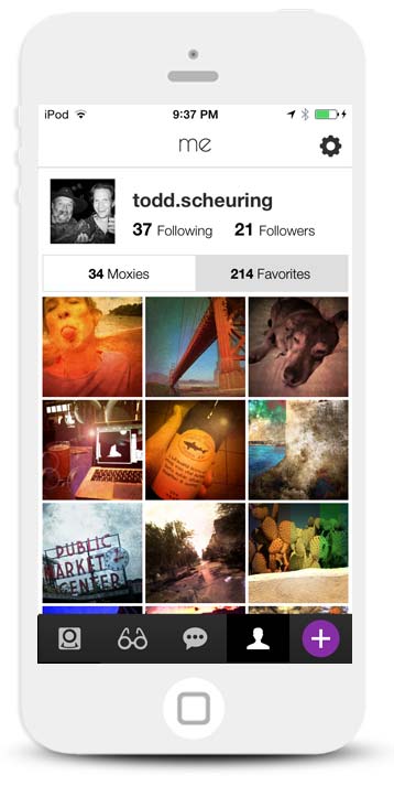
Profiles help people keep track of who they're following as well as their favorite artwork.
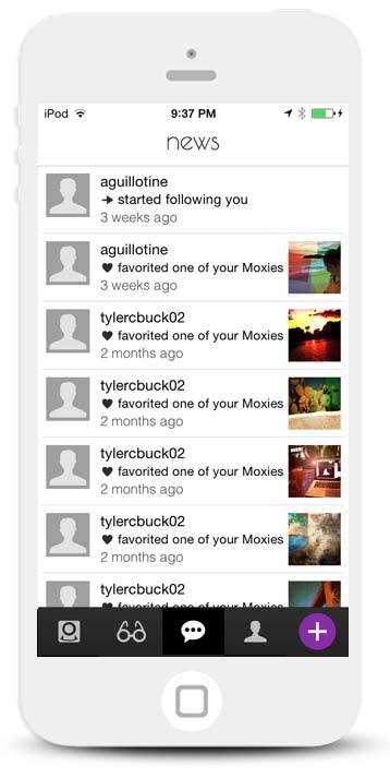
See updates about who's following you and who has favorited your artwork.
The challenge: We had a tough decision to make. Between creating a kick-ass photo editing tool and building a social network, we were starting to head in two separate directions. We knew we had to simplify the app and focus on one priority.
The process: We corresponded with users via email and sent out a google survey to our beta group to find out what people liked most about Moxie. It seemed that people were most intrigued by a platform to see other people's work, so we decided to prioritize building a network that let people reuse filters. The idea was to create a free app and eventually include paid add-ons. Building a network would help us create a dedicated community of photo artists and we could leverage the organic growth.
We sent out a google form to beta users and got back some great feedback. We found that people were most excited about seeing other people's work.
The solution: We decided to prioritize our efforts on creating a social network. As we started discussing and working through the various scenarios and flows we realized that building a network was a lot more involved than just a standalone photo app!
We found a third-party platform called Parse that provided a lot of existing network conventions from a commenting system to the ability to follow others.
Our main priority was growing the network and connecting users with each other and letting them use the app as a source of inspiration for their own photo art. We were going to focus on giving people the ability to:
- Create a profile (so they would have a presence in the network)
- Follow each other (so they could have a dedicated “feed” of curated artwork)
- Discover what other people have created (To showcase their own photo art and act as a source of inspiration)
Finding ways to increase conversions
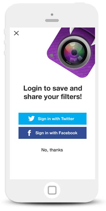
Originally, free users were encouraged to sign up for an account to get the full features of the app.
We removed the signup banners within the app and created an intro flow that forced people to login to the app.
Conversions increased from around 5% to 40%.
We experienced an increase in signups after we required authentication to use the app.
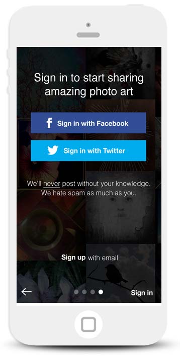
Since we prioritized building a network, our key performance indicator was focused on growth. We allowed people to create photos and post anonymously, so we focused on converting users within the app itself. We added signup screens throughout the app and experimented with different versions and motivations to convert people. Our idea was to provide enough value behind an authenticated account that people would want to sign up and unlock certain features. For example, users couldn't save their raw filters or interact with other Moxie artists without being logged in.
After a couple weeks we were still only seeing around a 23% signup rate. We started asking ourselves what value anonymous users actually provided and if we could afford alienating people who were unwilling to sign up. Revisiting our growth metric we decided that all users had to sign up to use the app. As we expected, some people were not pleased with the change. Nevertheless, our conversion rate quickly jumped to almost 40%.
A cuddly logo
As I approached the logo design, I wanted to make something that intrigued people as they searched through a sea of apps. I also wanted to make something fun and approachable.
Looking at other photo apps, there’s a trend in using elements of a camera - particularly the lens, which helps identify the app as something photo-related. I also found that most photo app logos are based on inanimate objects. Whereas I wanted to create something living and breathing, like the Moxie community itself, it’s constantly evolving. It wasn’t long before I started experimenting with the monster idea. I also liked the similar phonetics of the “mo” in “Moxie” and “monster”.
The more I iterated on the monster, the more it made sense. Sometimes your photo art is ugly - just like monsters are usually thought of as ugly - but that’s ok. Art doesn’t have to be pretty, it’s about experimenting and embracing imperfection. If you look close enough, the monster has a green scale, which is kind of like a birthmark to represent the imperfection of art and life.
Website and demo video
I designed and developed a responsive site to help promote the app and explain the benefits. I wanted to create a website that would explain the app's features and highlight actual user artwork. I created the site in HTML, CSS and JQuery.
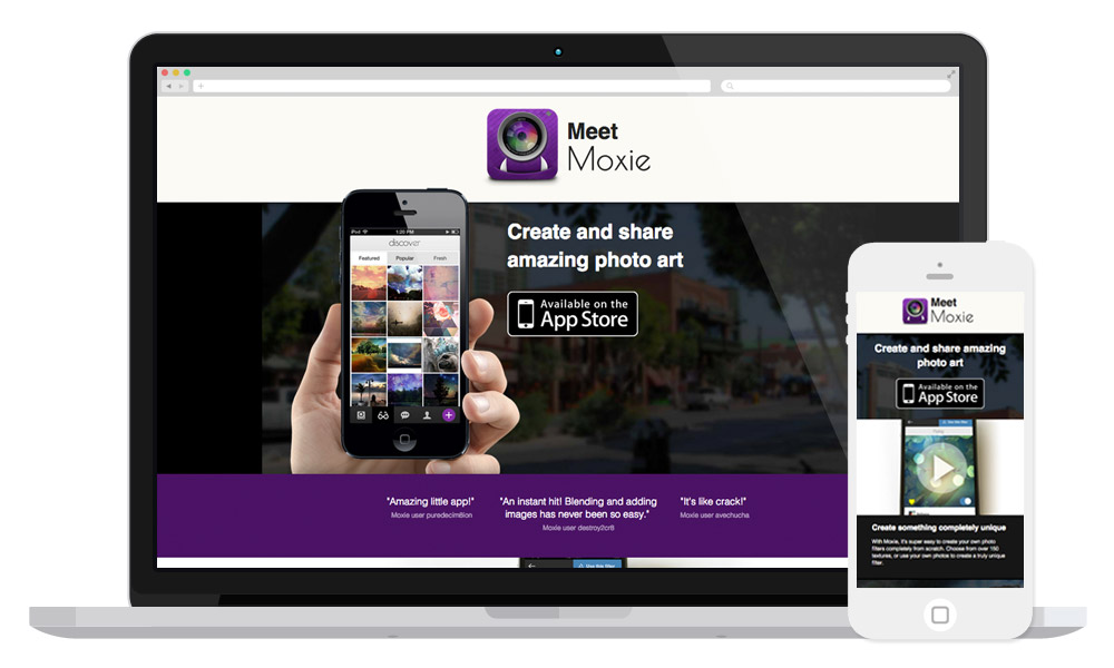
As part of our marketing efforts, I created a colorful responsive website to help promote the app
I also created a short video to provide a quick overview of the app and how it works.
Results
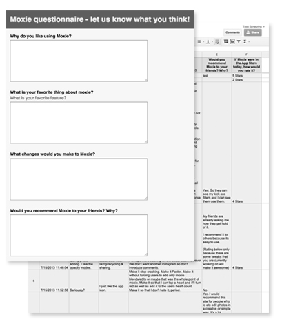
Overall, people really liked the app. With a 4-star review in the App Store we had some inspiring feedback:
"Instantly addictive and incredibly fun!"
- Andy McPants
"So many possibilities! The limit is boundless and you can do so much with this app."
- Josh Huling
"Very excited about this app. It's the most unique photo app I have seen out there. Love it!"
- Taranwk
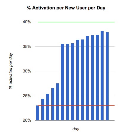
We also had a strong retention rate. 3 months after its release, our stats included:
- A 37% activation rate.
- An average of 2 app launches per user per day.
- An average of 2.5 photos edited per user per day
Our growth peaked at 4,000 downloads in a single day. Overall the app has been downloaded almost 25,000 times.
We also had some nice articles written about the app: