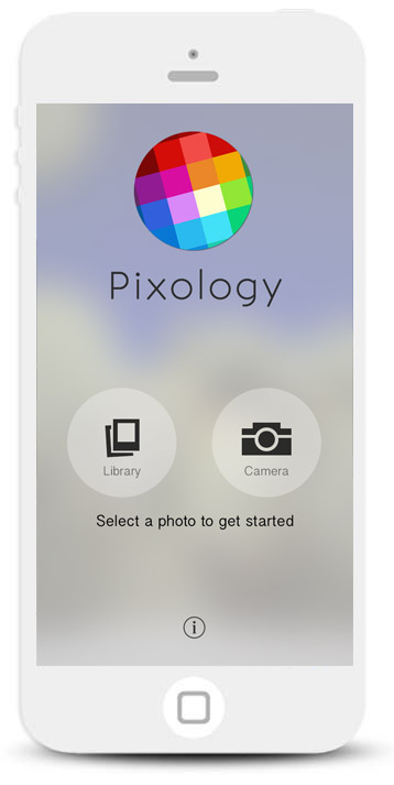
Pixology is a streamlined app that focuses on creating unique photo art.
Pixology is an iPhone app I co-created with my friend Kyle Steward. After we released Moxie, we decided to take what we learned and create a brand new photo editing app.
As the designer and product owner for the app, I was involved in every step of the way, including:
Design & UX | Usability testing | A/B Testing | Website design & Font-end development | Promotion video | Branding
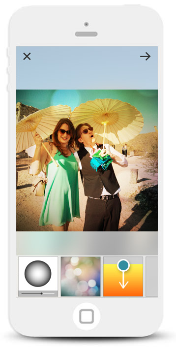
Editing layers quickly
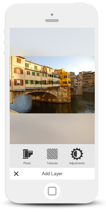
When people add a new layer we focus the UI on the task at hand without any other options.
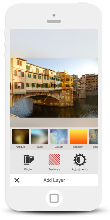
When people select a layer type, the options appear above their selection.
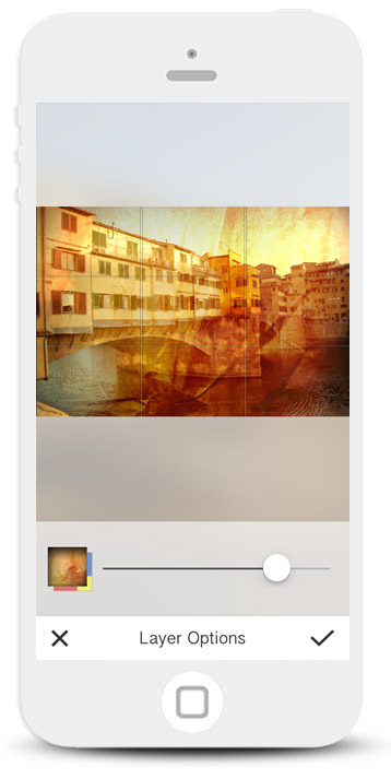
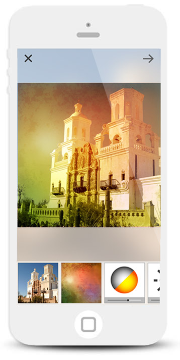
All layer editing features are positioned at the bottom of the screen, making it more accessible to reach with your thumb.
We wanted to make the photo editing process fast and accessible, so that people can edit and create photos in one sitting.
Thinking about the ergonomics of the UI, I wanted to make sure that a user could perform the majority of edits at the bottom of the screen with their thumb.
Your artwork is part of the experience
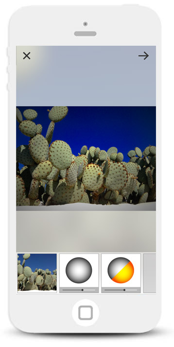
A person's artwork is displayed subtly in the background of the UI.
The idea was to create an immersive experience with your artwork.
Displaying the last edited photo on the home screen makes for an evolving UI.
Part of my design goals for the app was to create an experience that enhanced the photo editing process and make sure we didn’t disrupt the user’s flow in any way. I wanted to create a minimal UI that would focus on the content itself and bring the user’s artwork front and center.
I designed a minimal UI, but also took a step further by thinking about how the app could adapt to the user’s own artwork. I came up with the idea of incorporating the user’s artwork in the UI itself. As the user progressed through the photo editing process, we would use their current image, adjust the opacity and blur, and display it in the background. I wanted to make sure it was a subtle feature - almost like a subconscious feeling that you are somehow engulfed in the experience of your own artwork as you create it.
Interactivity as functionality
People can quickly swipe down to hide a layer.
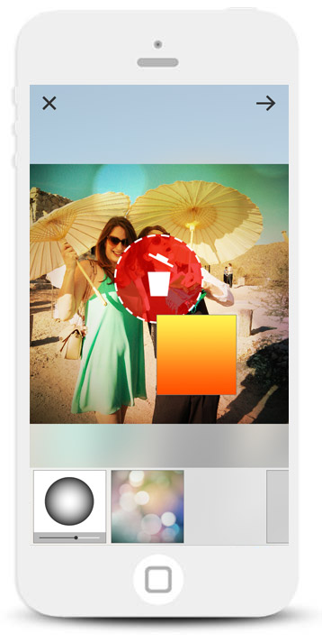
Hold down and drag a layer to the trash icon to delete it.
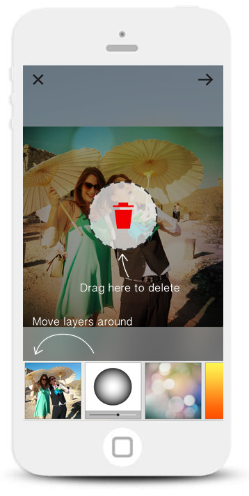
A quickly overlay teaches people how to perform these functions.
When we created Moxie, we learned that people liked to toggle layer visibility to see how it affects the main canvas, so I wanted to make sure we still allowed for this behavior. We also needed a way for people to delete layers. The challenge was that I didn’t want to include any extra UI and needed to figure out how to add the functionality without the affordance of a button.
The solution was to add the functionality into the layer thumbnails themselves, by introducing two new interactive options to the object:
- For visibility, people can swipe a layer down to turn a layer on and off. The object would use a springing animation before changing styles indicating the new state.
- For deleting, we realized that people were accustomed to a long-press convention on iOS when they wanted to delete their apps, so we borrowed the idea: to delete a layer, people can long-press a layer to unhinge it from the list. Instead of tapping on a delete button the item can be dragged into a trash icon on the center of the screen (We borrowed the dragging into trash idea from OSX).
Since these solutions lacked affordances, we introduced tutorial screens during the initial photo editing process.
Removing unnecessary decisions
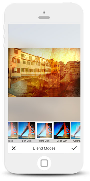
We removed the need to select a blend mode, but the option is still available for advanced user.
Another usability issue we noticed from Moxie was the process of selecting a blend mode after adding a new layer. In Moxie we forced people to choose a blend mode before continuing, but apart from designers and avid Photoshop users, most people have no understanding of “blend modes”.
The solution was to remove the step altogether and define each new layer with a default blend mode. That way people don’t have to think about blend modes at all, each layer will be brought in at an optimal setting.
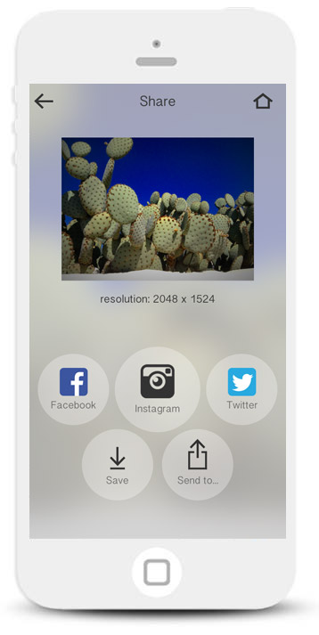
Website
I created a responsive site to help promote the app and explain the benefits.
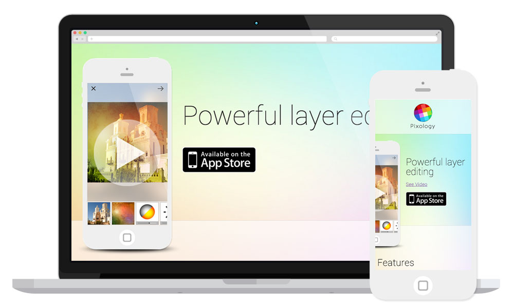
As part of our marketing efforts, I created a colorful website to help promote the app
Results
"Killer app to compliment Instagram"
- wjoseph808
"The only photo layering app you need"
- Q Bake
- 39,000 downloads.
- 4-star rating in the app store
- Featured in App Store's 'Apps for Friday Night'